Today, it takes only one hour to create what was two decades ago a year’s worth of data. And, the entire market for data science, analysis, and visualization is growing exponentially as well, with the market for data visualization growing at a CAGR of 9.69% over the next five years. On a similar note, the average salary for jobs that require data visualization skills in the United States is a whopping $188,827.
Enterprises around the world are pouring vast amounts of money into data visualization for a wide range of reasons:
- Data-driven decisions can improve a business’s competitiveness and fast-forward innovation.
- Raw data is difficult to interpret and impactful data visualizations can help stakeholders quickly grasp data insights.
- Visualizing data makes it possible to establish patterns and correlations, as well as track changes over time.
However, you don’t necessarily have to be a data analyst or data scientist to take advantage of data visualization. Regardless of whether you work as a finance professional, marketer, or teacher, data visualization tools can help you make your work more effective. For example, Florence Nightingale, a nurse best known for her work during the Crimean War, used data visualizations to help fight for better hospital conditions. There’s no limit whatsoever to the real-world applications you can find for visualizing data.
If you’d like to learn data visualization but don’t know where to start, consider enrolling in an online course. The best data visualization courses on this list cover everything from the fundamental concepts all the way to advanced topics that build upon those fundamentals.
These are the seven best data visualization courses for 2022.
Best Data Visualization Courses
Best Overall: Data Visualization Nanodegree (Udacity)
- Led by experienced data visualization experts
- Includes career support services
- Technical one-on-one mentorship
- Helps you build a data visualization portfolio
Cons
- None
Udacity’s “Data Visualization Nanodegree” is among the top data visualization courses for people from a business background and data professionals alike. In this course, a group of industry experts from companies such as IBM and Kaggle will give you a thorough deep dive into data visualization, and teach you how to master the most popular data visualization tool on the market: Tableau.
This course covers a remarkably wide range of topics, including but not limited to:
- Building interactive dashboards in Tableau based on user needs and feedback.
- Identifying biases in both numerical and non-numerical data.
- Adding interactivity features into charts, graphs, and dashboards.
- Creating animated dashboards using Tableau Pages.
This Nanodegree is split into four courses, and each of these courses includes a practical project designed to help you apply the skills you learned into the real world. For example, one of the projects involves visualizing airline and airport quality using a dataset of flight delays. And, another requires you to create interactive graphs, charts, and maps in order to visualize data sets obtained from the World Bank.
These types of practical projects are the best way to solidify what you learned, and they are far better at improving your chances of landing a data visualization role than passively following theoretical lectures. Employers value practical portfolios highly, and this online course guides you through the process of creating a high-quality portfolio of data visualization projects better than any other.
As for the prerequisites, some basic knowledge of descriptive statistics is recommended before taking this course. However, if you lack this knowledge, the free course “Intro to Descriptive Statistics“, also provided by Udacity, will get you up to speed in no time.
With plenty of interesting and educational video lessons, challenging real-world projects, mentorship services, and career support, Udacity’s “Data Visualization Nanodegree” has to be among the very best data visualization courses online for 2022.
Best Introduction: Understanding Data Visualization (DataCamp)
50% off Unlimited Data and AI Learning (expires 28 March 2024)
- No prerequisites
- Full of hands-on exercises
- Includes real-world datasets
Cons
- Very little content
- Does not go in-depth into any particular concept
- Exercises are too easy at times
If you want to learn data visualization but don’t know where to start, consider enrolling in “Data Visualization for Everyone” on DataCamp. This course will teach you the basics of what you need to know to create your first data visualization in just two hours.
This course is short, but it covers quite a few topics, including:
- Choosing the right data visualization dashboard.
- Visualizing the spread of a variable using histograms and box plots.
- Assessing the relationship between two continuous and categorical variables via scatter plots, line plots, bar plots, and dot plots.
- Adding color and shape to data visualizations to make them easier to understand.
- Recognizing and avoiding common plot problems.
Moreover, the course doesn’t just go over theory, either. While the program includes 14 short video lessons, the focus here is on hands-on experience. Indeed, students get to practice immediately everything they learn with more than 40 exercises. And, the exercises include real-world datasets like Los Angeles home prices.
“Data Visualization for Everyone” is another great data visualization course, but it would certainly benefit from additional lessons and more depth. It works great as a bonus lesson, but it will not turn you into a data viz all by itself.
Best for Tableau: Data Visualization with Tableau (Coursera)
40% ($140 USD) off your first year of Coursera Plus Annual (expires 2 December 2024)
- Created by one of the top public universities in the U.S.
- Includes a capstone project
- Nice mix of theory and practice
- Data visualization certification upon completion
Cons
- Not everyone is happy with peer-reviewed assignments
Designed by the University of California, Davis, and available via Coursera, “Data Visualization with Tableau” does precisely what it says: shows you how to use Tableau to generate powerful visualizations and dashboards.
What makes this data visualization training program stand out from similar courses on the market is that it dives deep into data visualization theory. In other words, with this course, students learn not only “how” to visualize data but also “why.” For example, one of the first lessons in this course looks at how the brain relates to visual design.
That being said, there are plenty of practical elements in this course, too (not least the capstone project that involves creating a single-frame visualization or multi-frame data story for a fictional company).
No prior experience is required to enroll in this specialization. However, students should be comfortable working with data sets. Most students complete this course in about six months by studying three hours a week.
If you’re looking to learn Tableau, Data Visualization with Tableau is one of the best data visualization programs for you. While you can audit course material for free, you’ll need to enroll in this program to earn a data visualization certification.
Become a Data Visualization Specialist: Concepts (LinkedIn Learning)
- No prerequisites
- Under 14 hours long
- Covers both data storytelling and data visualization
- Includes practice tests and exams
Cons
- Does not go deep into some fundamental concepts
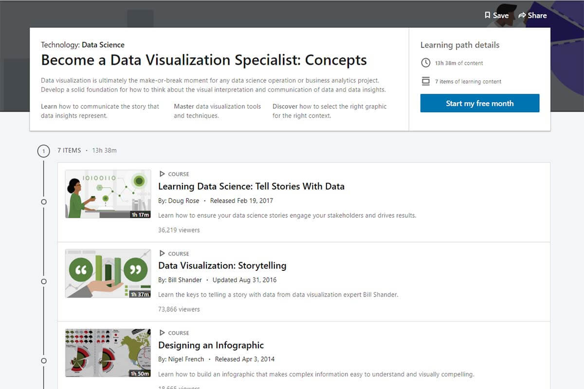
“Become a Data Visualization Specialist: Concepts” is a learning path on LinkedIn that explores both data storytelling and data visualization. Although the two concepts are intertwined, they’re not the same.
Data visualization is the graphical representation of collected information. On the other hand, data storytelling involves taking complicated data analyses and turning them into stories that are easily understood by an audience.
Taught by five instructors (including two CEOs that have founded their own companies), this data visualization training program is made up of just under 14 hours of content and seven courses:
- Courses one and two teach students how to effectively tell a story with data and leverage tables, charts, and visuals accordingly.
- Course three explains how to build an infographic from scratch using Adobe Illustrator, Adobe Photoshop, Adobe InDesign, and Microsoft Excel.
- Course four demonstrates how to “turn information into artwork.”
- Course five runs through data visualization best practices and common pitfalls.
- Course six highlights the key challenges analysts face when communicating complex information and suggests ways to overcome them.
- Course seven goes over data visualization tips and tricks (for example, how to choose the right visualization).
Each course comprises short video lessons (typically under five minutes long) and exercises and includes quizzes and exams that test your knowledge.
Become a Data Visualization Specialist: Concepts is one of the best data visualization courses out there. One reason for that is that it’s broken down in such a way that makes it easy for students to fit it into their busy schedules. Another is that it comes with a data visualization certificate upon completion. We also love that this path has a second part: “Become a Data Visualization Specialist: Tools” — accessible to anyone with a LinkedIn Learning subscription.
Data Visualization in R (DataCamp)
50% off Unlimited Data and AI Learning (expires 28 March 2024)
- First “chapter” is free
- Focuses on base graphics, which is easy to learn
- Hands-on exercises
Cons
- Only 4 hours long
- Some of the exercises may be too easy
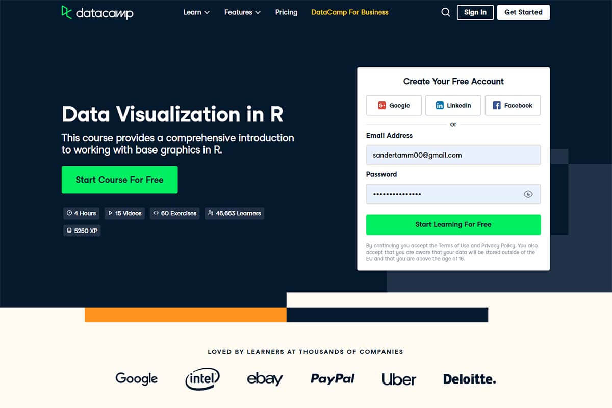
R is an awesome platform for data analysis. With it, you can create pretty much any type of graph you want. DataCamp’s Data Visualization in R will show you how to do just that.
However, even though Data Visualization with R is one of the best data visualization programs with R, it’s not meant for R beginners. Rather, students are expected to be familiar with this programming language already. If you’re not but would still like to learn how to build visualizations and present data with R, check out our roundup of the best R courses.
So, what will you learn in this four “chapter” (or 14 videos and 43 exercises) Skill Track? Although R supports a number of different graphics systems, this course zeroes in on base graphics, otherwise known as traditional graphics.
You start with an overview of base graphics before moving on to different plot types (like histograms and scatter plots). The course ends with examples and hands-on exercises in plot customization (including how to modify point shapes and sizes, add explanatory text, and use color effectively).
If you have experience with R, it makes sense to learn how to create visualizations using this programming language. One of the best online data visualization courses for R, DataCamp’s Data Visualization with R will give you the rundown on how to use the long-established, built-in facilities in R, known as base graphics.
Data Visualization with Python (Coursera x IBM)

40% ($140 USD) off your first year of Coursera Plus Annual (expires 2 December 2024)
- Designed by IBM
- 7-day free trial
- Data visualization certification upon completion
Cons
- Some of the assignments topics are reportedly not covered in the class
Offered by IBM on Coursera, “Data Visualization with Python” promises to show you how to take seemingly meaningless data and, using Python, present it in a way that makes sense to people.
This data visualization training program covers several data visualization libraries in Python, most notably matplotlib. However, the program also takes a look at Seaborn, a visualization library based on matplotlib that’s useful for generating regression plots, and Folium, a Python library used for visualizing geospatial data.
At the end of the three-week course, students have to complete a peer-graded assignment. Because the assignment has questions that are not part of the program, it’s quite challenging but a good way to prepare for real-world projects.
This course is intended for intermediate users with some knowledge of Python. Completing this course also counts towards a few other Coursera Specializations, including IBM Data Analyst Professional Certificate, IBM Data Science Professional Certificate, and Applied Data Science Specialization. In total, the course takes about 18 hours to finish.
Those with experience in Python will love Coursera’s Data Visualization with Python. With this course, you can learn the best techniques to analyze and visualize data with the Python programming language.
Learn Data Visualization with Python (Codecademy)
- 7-day free trial
- Includes projects and quizzes
- Data visualization certificate of completion
Cons
- None
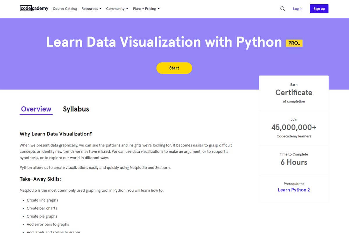
If you know basic Python (i.e., you can write functions, call methods and objects, and use lists and loops), you could learn how to create visualizations after just six hours of study. And, if you don’t, consider enrolling in one of these online Python courses as a first step.
This Codeacademy course is split into two parts. The first part focuses on the plotting library matplotlib. Here, students learn how to design line graphs, bar charts, and pie graphs. This is also where they gain knowledge on how to add error bars, labels, and styling to graphs. At the end of the first part, students get to practice making line graphs.
The second part takes a look at Seaborn, a Python data visualization library based on matplotlib. This is where students master choosing color schemes for their graphs. At the end of the second part of the course, students have to visualize World Cup data with Seaborn. Students that get to the end of this course earn a certificate of completion.
If you already have a Codeacademy subscription and know how to code in Python, enrolling in “Learn Data Visualization with Python” is a no-brainer. However, even if you don’t have a subscription, a Codeacademy membership might still be worth it, especially if you want to improve your coding skills (or even learn coding from scratch).
